A Gantt chart is only as useful as the information it surfaces. Static bars on a timeline tell you what is scheduled — but they don't tell you what is connected to what, where the schedule has slipped from the original plan, or how much room a task has before it becomes critical. Modern project schedulers solve this by building interactive intelligence directly into the chart.
Maverick Project Scheduler's Gantt chart goes far beyond bars and dates. This article walks through ten innovations that make the Maverick Gantt chart faster to read, more interactive to use, and more informative at a glance — all driven by the scheduling engine running behind the scenes.
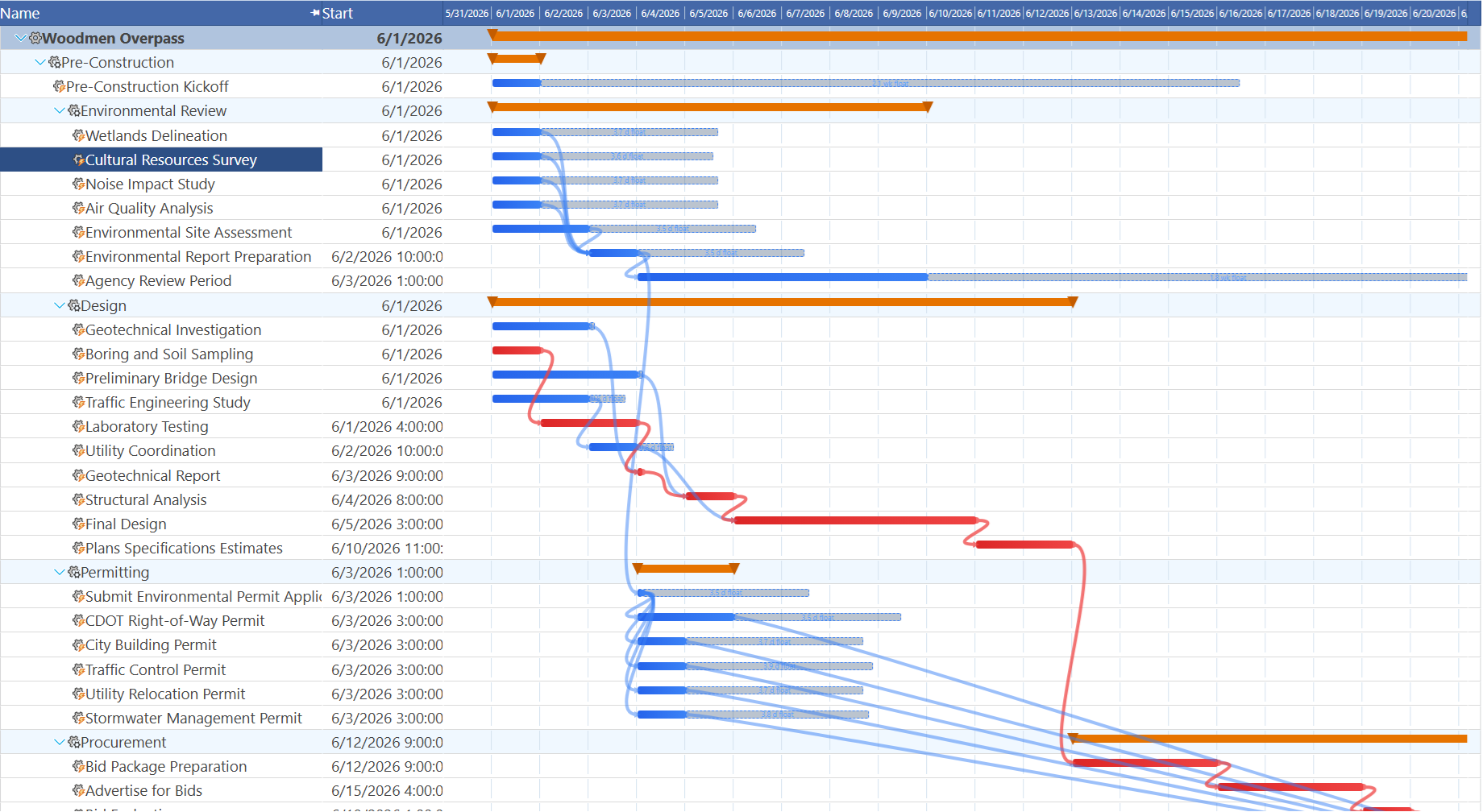
1 & 2 — Hover Highlighting on Task Bars and Link Lines
When you hover over any task bar in the Maverick Gantt chart, the chart immediately highlights every dependency arrow connected to that task and glows the predecessor and successor bars at the far ends of those arrows. You can see the full dependency chain for one task without reading a single cell in the grid — just hover.
The highlighting works in both directions. Hover the predecessor bar and you see all its successors light up. Hover the successor bar and all its predecessors illuminate. When a task is connected to three or four others, every arrow and every related bar reacts at the same moment, giving you an instant picture of the scheduling network around that task.
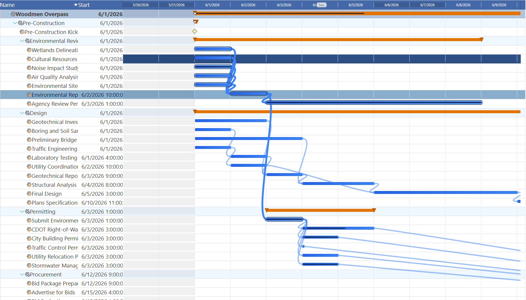
Hovering over a link line arrow itself does something different: a tooltip appears naming the predecessor, the successor, and the relationship type — for example, "Foundation Work → Concrete Pour (FS)". This is particularly useful on dense schedules where many link lines cross each other and it is not obvious which arrow connects which tasks.
The arrows themselves are animated using SVG stroke-dasharray animation, which draws each bezier curve link line into view when the Gantt first loads — making the dependency structure feel alive rather than static.
3 — Ghost Baseline Bars
When a project baseline has been saved, the Maverick Gantt chart renders a ghost baseline bar directly below each live task bar — but only when the dates have changed since the snapshot was taken. If a task is still on its original schedule, no ghost appears and the view stays clean. If the task has slipped or been moved forward, a translucent dashed bar appears below the live bar, aligned to where that task originally sat on the timeline.
At a glance you can see not just that a task has moved, but by how much and in which direction. A ghost bar sitting to the left of the live bar means the task finished early. A ghost bar sitting to the right means it has slipped. The gap between the two shows the magnitude of the change in calendar days.
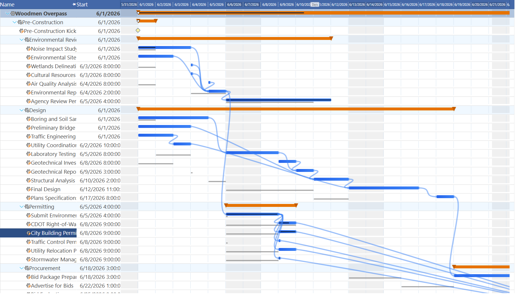
Milestones get their own ghost treatment — a baseline ghost milestone renders as an outline-only diamond at the original milestone date, clearly distinct from the solid filled diamond of the current milestone position. This makes it easy to present schedule variance to stakeholders in the chart itself, without exporting to a separate report.
4 — The Today Line with a Label
A vertical Today line runs the full height of the Gantt chart at the current calendar date. On the first task row, a small "Today" label pins to the top of the line so the marker is always identifiable even when the chart is scrolled. The line updates its position on every rebuild so it always reflects the real current date without requiring a page refresh.
During zoom changes and navigation scrolls, the Today line recomputes its pixel position from the updated scale so it stays locked to the correct date regardless of the zoom level or how far the chart has been scrolled left or right. The Today line is one of the simplest features on the chart, but it is consistently the first thing project managers look at when they open the schedule.
5 — Weekend Shading in Days Scale
When the Gantt chart is zoomed into Days scale — showing one column per calendar day — the Saturday and Sunday columns receive a subtle background shading that distinguishes them from weekdays. The shading uses a CSS repeating gradient computed from the scale start date and the pixels-per-day zoom level, so it always aligns correctly with the actual day of week regardless of when the visible window starts.
The scale header also highlights Saturday and Sunday column cells, so the weekend pattern is visible in both the header and the bar rows simultaneously. Weekend shading disappears automatically at Weekly, Monthly, and coarser zoom levels where per-day columns are no longer meaningful.
6 — Navigation Overlay Buttons
Five navigation buttons appear over the Gantt scale header whenever the mouse hovers over it. They disappear when the mouse moves away, keeping the chart view clean when not in use. The left group contains three controls: Scroll Left (moves one interval unit), Page Left (moves one full visible width), and Scroll to Selected (a circle button that jumps the Gantt start date to the earliest date of the currently selected task). The right group contains Page Right and Scroll Right.

Holding a scroll or page button down triggers auto-repeat after a 400-millisecond delay, then fires at 80-millisecond intervals for continuous scrolling. Releasing the mouse button anywhere on the page stops the repeat immediately. During continuous scrolling, bar positions update in place without rebuilding the DOM — only the pixel offsets change — making even large projects scroll smoothly at full speed.
A small zoom level label ("Days", "Weeks", "Months", "Quarters", "Years") sits centered in the scale header so the current scale is always visible without needing to open a settings panel.
7 — Wheel Zoom
Rolling the mouse wheel over the Gantt scale header zooms the chart in and out by adjusting the pixels-per-day value. Scrolling up zooms in (showing more detail per day), scrolling down zooms out (fitting more of the timeline on screen). The zoom range runs from 2 pixels per day — enough to see a multi-year project at a glance — to 100 pixels per day, which shows individual days at a comfortable reading width.
The new zoom level is saved to both the browser's localStorage and the server session, so the zoom level survives page reloads and browser restarts. During an active wheel gesture, the chart uses a fast-path that scales existing bar positions mathematically rather than rebuilding the DOM, keeping the animation smooth even on projects with hundreds of tasks.
The same zoom can also be set by dragging the resize handle at the right edge of any scale header cell — pulling the divider left zooms out and pulling it right zooms in, with live feedback updating the chart on every mouse-move event.
8 — Child Milestones Overlaid on Summary Bars
When child tasks have milestone dates, the Maverick Gantt chart renders small white diamond markers directly on top of the parent summary bar at each child milestone's date position. These summary milestones are visually distinct from standalone milestone tasks — they use a smaller white diamond with a colored border rather than the solid filled diamond used for task-level milestones.

This means a collapsed project view — showing only the summary bar — still communicates all the key milestone dates inside that phase without requiring the user to expand the hierarchy. Stakeholders can review the high-level schedule and immediately see when major deliverables are due, even with the task-level detail hidden.
9 — Critical Path Color Coding
When the critical path calculation has been run, each task bar and each dependency arrow is independently colored to show whether it is on the critical path or not. Critical task bars render in red; non-critical bars render in blue. The dependency arrows between critical tasks render in red; arrows between non-critical tasks render in blue.
This coloring means the critical path is visible instantly without any additional filtering or highlighting step. Project managers can see at a glance which tasks drive the project end date and which have schedule flexibility. The color coding is applied per-task — a mixed schedule where some tasks are critical and others are not renders clearly, with the critical chain standing out in red against the blue background of non-critical work.
The arrow hover highlighting described in features 1 and 2 is also critical-path-aware: when you hover a red critical bar, its connected arrows and neighbor bars glow in the critical path color, so the chain of dependent critical tasks is always one hover away.
10 — Float Bars
Every non-critical task has some amount of total float — the number of days it can slip before it falls onto the critical path and begins delaying the project. Maverick's Gantt chart renders this float as a translucent bar extending from the right edge of the task bar. The float bar shows both the duration of the float (its width) and the label — either in days ("18d float") or in weeks ("2.6 wk float") for longer floats.
Float bars are color-coded to match their task bar: blue for non-critical tasks. They share the same drag group as the task bar, so when a task is moved by dragging, the float bar moves with it and the scheduler automatically recalculates the remaining float based on the new position. Float bars do not appear on critical tasks (zero float) or summary bars, keeping the display uncluttered.
Together, critical path color coding and float bars give project managers a complete picture of schedule risk: red bars are the tasks that cannot slip at all, and the length of each blue float bar tells you exactly how much slack each non-critical task has before it becomes a problem.
See These Innovations in Your Own Projects
Every Gantt chart innovation described in this article is available in the Maverick Project Scheduler free trial — hover highlighting, baseline comparisons, critical path colors, float bars, and all the rest. Start scheduling your real projects today.
Try Maverick Free