
What You'll Build
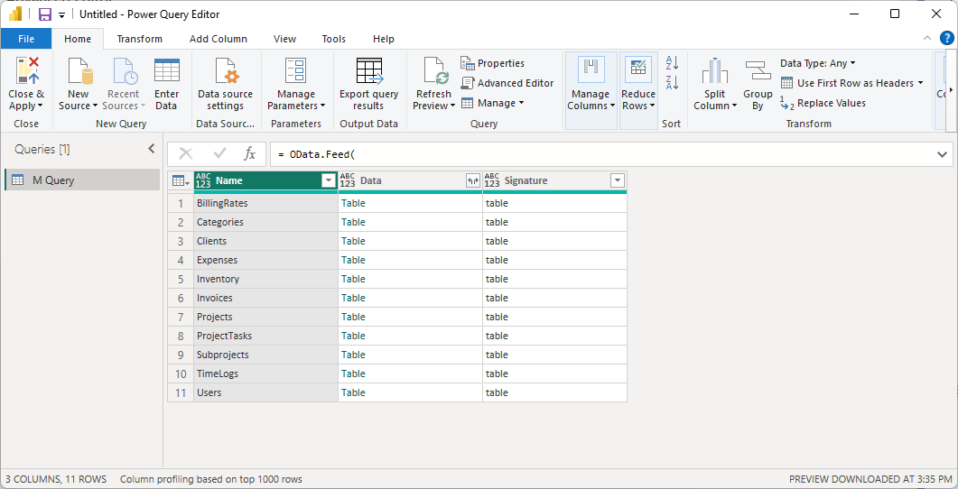
These four visually striking dashboards connect Power BI Desktop directly to your live Maverick schedule data via the OData v4 feed. All four share the same two primary queries — Projects and ProjectTasks — loaded once and reused across every page. Refresh once and all four dashboards update together.

- Dashboard 1 — Project Schedule Health: KPI cards for active projects, total tasks, overdue tasks, and average percent complete. Donut chart by status. Bar chart of completion by project. Overdue task table ranked by days late.
- Dashboard 2 — Portfolio Gantt Timeline: A floating Gantt-style bar chart color-coded by schedule status, a date range slicer, a monthly task-density heatmap, and a cumulative completions line chart.
- Dashboard 3 — Work Progress & Hours Burndown: Planned vs. actual vs. remaining hours by project, a scatter plot of task efficiency, and a funnel chart of tasks by completion stage.
- Dashboard 4 — Project Cost & Budget Intelligence: Quoted vs. actual vs. remaining cost, a waterfall chart of budget variance per project, an over-budget task ranking table, and a cost-share donut by client.
Before you start — two things you need:
- Your API Key (generated inside Maverick — see Step 2 below)
- Your CID (cloud accounts only — the long alphanumeric company ID in your account settings; on-premise installations skip this)
Jump to a Section
Step 1 — Install Power BI Desktop
Power BI Desktop is Microsoft's free report-building application. It runs on Windows and connects to hundreds of data sources, including OData feeds. The easiest way to install it is from the Microsoft Store — updates are automatic and no administrator rights are required.
- Press the Windows key and type Microsoft Store, then press Enter.
- In the search bar at the top of the Store, type Power BI Desktop and press Enter.
- Select Power BI Desktop from the results (published by Microsoft Corporation).
- Click Get (or Install) and wait for the download to complete.
- Click Open to launch it, or find it later in the Start menu.
Power BI Desktop is completely free for local report building. Publishing reports to the Power BI cloud service for team sharing requires a paid Power BI Pro license, but that is not needed for any of the four dashboards in this guide — you can build and view all of them locally at no cost.
When Power BI opens, you may see a "Get Started" splash screen or a sign-in prompt. Close it — you do not need to sign in to a Microsoft account to build local reports.
Step 2 — Generate Your API Key
Every Maverick OData request must include an API key sent as an HTTP request header named X-Api-Key. The key identifies your account and grants access to your project data. Generate one from inside the Maverick application:
- Open Maverick and log in with your account.
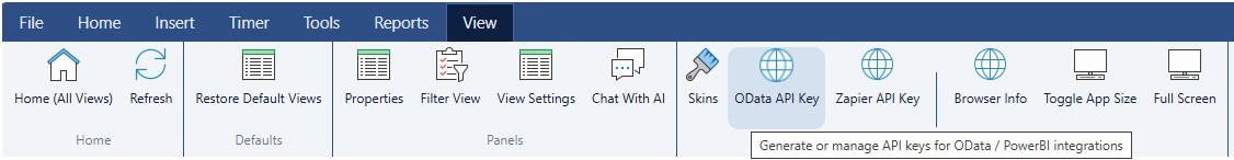
- Locate the API Keys button in the ribbon toolbar at the top of the application.
- Click it to open the API Key Manager.
- Click Generate New API Key.
- Give the key a label — for example, Power BI — so you can identify it later if you need to delete or rotate it.
- Copy the key immediately. It will not be shown in full again after you close this dialog.
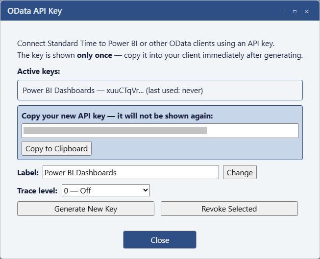
Keep your API key private. Anyone who has it can read your project data through the OData feed. If a key is ever compromised, return to the API Key Manager, delete it, and generate a new one. The old key stops working the moment it is deleted.
Cloud vs. On-Premise: the CID Parameter
The example queries throughout this guide contain a URL parameter that looks like this:
?cid=YOUR_CID_HERE
The CID parameter is only required for the Maverick cloud site (stcloud67.com and others). It is a long alphanumeric company identifier that tells the cloud server which organization's database to query. Find your real CID in your Maverick account settings or in the browser address bar when you are logged into the cloud site — it will be much longer than the short placeholder shown here.
If Maverick is installed on-premise on your own server, you do not use a CID at all. Drop the &cid=YOUR_CID_HERE portion from every URL and replace the host with your server address:
https://your-server.com/odata/Projects
On-premise queries connect directly to your local server — no company identifier is needed because the server already knows which account it serves.
Dashboard 1 — Project Schedule Health
What you'll build: An executive-level overview of your entire project portfolio — which projects are on track, which tasks are overdue, and where work is piling up. This is the most commonly shared dashboard in project reviews.
- Four KPI cards across the top: Active Projects · Total Tasks · Overdue Tasks · Avg % Complete
- Donut chart: task count by Status
- Horizontal bar chart: % complete per project, sorted best to worst
- Table: overdue tasks with name, project, finish date, and days late
- Slicer: filter the entire page by project name
Step A — Load the Projects Table
Every query in this guide follows the same four-step pattern: Home → Get Data → Blank Query → Advanced Editor. Follow these steps carefully the first time — you'll repeat this exact pattern for every additional table.
- In Power BI Desktop, click Home in the ribbon at the top of the window.
- Click the small arrow below the Get Data button to open the dropdown menu.
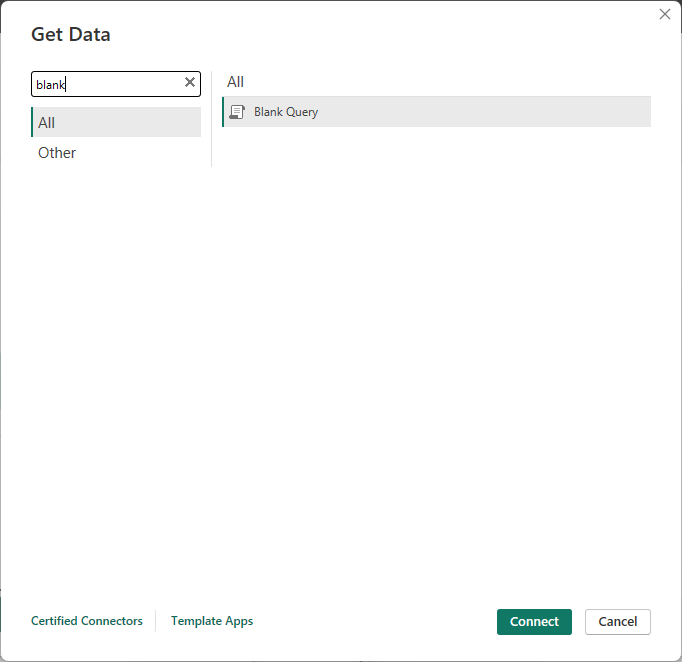
- Click Blank Query near the bottom of the list. The Power Query editor opens in a new window. You will see a single query called "Query1" in the left panel.
- Inside the Power Query editor, click the Home tab in the editor's own ribbon (not the main Power BI ribbon you just clicked).
- Click Advanced Editor. A small code dialog opens with a few lines of placeholder code.
- Select all the placeholder code and delete it. Then paste the query below, replacing
YOUR_CID_HEREwith your actual CID andYOUR_API_KEYwith the key you just generated:
let Source = OData.Feed( "https://stcloud67.com/odata/Projects?cid=YOUR_CID_HERE", null, [Headers = [#"X-Api-Key" = "YOUR_API_KEY"]] ) in Source
On-premise: Remove ?cid=YOUR_CID_HERE and replace the host with your server's address.
- Click Done. Power BI fetches your projects. You should see a table appear with columns like
ProjectName,Status,StartDate,FinishDate,Active,ClientName,ManagerFullName, and more. - In the Query Settings panel on the right side of the editor, find the Name field and change "Query1" to
Projects. - Click Home → Close & Apply (the large green button in the top-left corner of the editor). Power BI loads the data and closes the editor.
Step B — Load the ProjectTasks Table
Repeat the same process to load task-level data. Back in the main Power BI window:
- Click Home → Get Data → Blank Query.
- In the Power Query editor, click Home → Advanced Editor.
- Delete the placeholder code and paste this query:
let Source = OData.Feed( "https://stcloud67.com/odata/ProjectTasks?cid=YOUR_CID_HERE", null, [Headers = [#"X-Api-Key" = "YOUR_API_KEY"]] ) in Source
- Click Done. You will see task rows with columns including
TaskName,ProjectName,PercentComplete,StartDate,FinishDate,Completed,ActualHours,RemainingHours,Status,TaskQuotedCost, and more. - Rename the query from "Query1" to
ProjectTasks. - Click Home → Close & Apply.
Once both queries are loaded, you will see Projects and ProjectTasks listed in the Fields panel on the right side of the main Power BI window.
Step C — Connect the Two Tables
Power BI needs to know that ProjectTasks.ProjectID belongs to Projects.ProjectID so that slicers and cross-filters work correctly across both tables.
- In the left icon bar of Power BI Desktop, click the Model icon (three boxes connected by lines).
- You will see two table boxes — Projects and ProjectTasks — with their column names listed inside each box.
- Click
ProjectIDinside the Projects box and drag it ontoProjectIDinside the ProjectTasks box. A line appears connecting the two tables.
- Double-click the connecting line to open the Edit Relationship dialog.
- Confirm these settings:
- Table 1: Projects, Column: ProjectID
- Table 2: ProjectTasks, Column: ProjectID
- Cardinality: One to Many (one project has many tasks)
- Cross filter direction: Single
- Click OK.
Step D — Add Calculated Columns to ProjectTasks
Calculated columns add new fields row by row using DAX formulas. They differ from measures (which aggregate across rows) in that they are stored with the table and can be used as filters, slicers, or axis categories.
Click the Data icon (table icon) in the left bar. In the Fields panel, click ProjectTasks to select that table. Then in the ribbon click Table tools → New column for each column below.
Column 1 — Schedule Status assigns each task one of four labels based on its finish date and completion flag:
Schedule Status = IF(ProjectTasks[Completed] = TRUE(), "Complete", IF(ProjectTasks[FinishDate] < TODAY() && ProjectTasks[Completed] = FALSE(), "Overdue", IF(ProjectTasks[StartDate] > TODAY(), "Not Started", "In Progress")))
Column 2 — Days Late shows how many calendar days past the finish date an overdue task is. Non-overdue tasks get 0:
Days Late = IF( ProjectTasks[Completed] = FALSE() && ProjectTasks[FinishDate] < TODAY(), DATEDIFF(ProjectTasks[FinishDate], TODAY(), DAY), 0 )
Column 3 — Completion Bucket groups tasks into four ordered progress bands. The leading numbers force the buckets to sort correctly in charts:
Completion Bucket = IF(ProjectTasks[PercentComplete] = 0, "1 · Not Started (0%)", IF(ProjectTasks[PercentComplete] < 50, "2 · In Progress (1–49%)", IF(ProjectTasks[PercentComplete] < 100, "3 · Nearly Done (50–99%)", "4 · Complete (100%)")))
This column is reused by Dashboard 3, so creating it here means it is already available on later pages.
Step E — Add Measures
Measures are DAX calculations that aggregate across rows and respond dynamically to slicers and filters. They are not stored in the table but recalculated on demand.
With ProjectTasks selected in the Fields panel, click Table tools → New measure for each formula below. Copy and paste the entire block, then press Enter or click the checkmark in the formula bar.
Total Tasks = COUNTROWS(ProjectTasks)
Completed Tasks = COUNTROWS(FILTER(ProjectTasks, ProjectTasks[Completed] = TRUE()))
Overdue Tasks = COUNTROWS( FILTER(ProjectTasks, ProjectTasks[Completed] = FALSE() && ProjectTasks[FinishDate] < TODAY() ) )
Avg Pct Complete = AVERAGE(ProjectTasks[PercentComplete])
Now click Projects in the Fields panel (to switch the target table) and add this one measure to the Projects table:
Active Projects = CALCULATE(COUNTROWS(Projects), Projects[Active] = TRUE())
Step F — Build the Report Page
Click the Report icon (bar chart icon) in the left bar to return to the canvas. You will see a blank white canvas with a Visualizations panel on the right and a Fields panel further right.
KPI Cards — top row: In the Visualizations panel, click the Card visual icon (the one showing a single large number). Drag the card visual to the top-left of the canvas. In the Fields panel, expand Projects and drag Active Projects into the Fields well of the card. The card shows your active project count.
Repeat to place three more Card visuals side by side:
ProjectTasks → Total TasksProjectTasks → Overdue Tasks— in Format → Data label, set the color to red so it stands outProjectTasks → Avg Pct Complete— in Format, set decimal places to 1 and add "%" as a suffix under Value format
Donut chart — task count by Status: Click an empty area of the canvas, then click the Donut chart icon in the Visualizations panel. Drag ProjectTasks → Status to the Legend well and ProjectTasks → Total Tasks to the Values well.
Horizontal bar chart — % complete by project: Click an empty canvas area, then click the Clustered bar chart icon. Drag Projects → ProjectName to Y axis and ProjectTasks → Avg Pct Complete to X axis. Click the "..." menu on the chart, then Sort axis → Avg Pct Complete (descending) to put your most-complete projects at the top.
Overdue task table: Click an empty canvas area, then click the Table visual icon. Drag these fields into the Columns well: TaskName, ProjectName, FinishDate, Days Late, PercentComplete. In the Filters panel, drag Schedule Status into "Filters on this visual" and set the filter to show only the value "Overdue". Sort the table by Days Late descending so the most delayed tasks appear at the top.
Project slicer: Click an empty canvas area, then click the Slicer icon. Drag Projects → ProjectName to the Field well. In Format, set Style to Dropdown to save canvas space. Selecting a project in the slicer filters the entire page — all cards, charts, and the table update simultaneously.
Format and polish: Select all four KPI cards (Ctrl+click each). In Format → General, set Background to dark navy (#0F2341) with white data label color so they pop against the canvas. Set the canvas background via Format → Wallpaper. Right-click the "Page 1" tab at the bottom of the window and choose Rename page → type Schedule Health.
Dashboard 2 — Portfolio Gantt Timeline
What you'll build: A visual timeline showing when every task across all projects is scheduled to happen, a date slicer for zooming into any time window, and a monthly heatmap showing where work is most concentrated.
- Floating Gantt-style bar chart (tasks as rows, bars color-coded by schedule status)
- Date range slicer — filter to any start-to-finish window
- Project slicer
- Matrix heatmap: tasks active per month per project
- Line chart: cumulative task completions over time
Step A — Add Gantt Columns to the ProjectTasks Query
Power BI does not have a native Gantt visual, but you can simulate one with a stacked bar chart by adding two numeric columns: an invisible offset bar that positions the bar at the correct date, and a visible duration bar that shows how long the task runs.
Click Home → Transform data to reopen the Power Query editor. Select the ProjectTasks query in the left panel. In the ribbon, click Add Column → Custom Column.
Column name: DurationDays — the length of the task in calendar days:
Duration.Days([FinishDate] - [StartDate])
Column name: GanttOffset — days elapsed between a fixed anchor date and the task's start date. This is what positions the bar horizontally on the chart. Change the anchor date to just before the start of your earliest project:
Duration.Days([StartDate] - #date(2024, 1, 1))
Changing #date(2024, 1, 1) to a date close to your earliest project prevents wasted canvas space at the left edge of the chart.
Click Close & Apply to save the changes and return to the main window. DurationDays and GanttOffset now appear as columns in the ProjectTasks table.
Step B — Add DAX Measures
With ProjectTasks selected in the Fields panel, add these three measures using Table tools → New measure:
Tasks Starting This Week = COUNTROWS( FILTER(ProjectTasks, ProjectTasks[StartDate] >= TODAY() && ProjectTasks[StartDate] <= TODAY() + 7 ) )
Tasks Finishing This Week = COUNTROWS( FILTER(ProjectTasks, ProjectTasks[FinishDate] >= TODAY() && ProjectTasks[FinishDate] <= TODAY() + 7 ) )
Cumulative Completions = CALCULATE( COUNTROWS(FILTER(ProjectTasks, ProjectTasks[Completed] = TRUE())), ProjectTasks[CompletedDate] <= MAX(ProjectTasks[CompletedDate]) )
Step C — Build the Gantt Chart
Add a Stacked bar chart to the canvas. Configure it:
- Y axis:
ProjectTasks → TaskName - Values — first series (invisible offset):
ProjectTasks → GanttOffset - Values — second series (task bar):
ProjectTasks → DurationDays
Select the chart. In Format → Data colors, set the color for GanttOffset to exactly match your canvas background color (e.g., #0D1B2A if using the dark theme). This hides the offset series completely, leaving only the DurationDays bar floating at the correct horizontal position.
Apply conditional formatting on the DurationDays data color: click "..." on DurationDays in the Values well → Conditional formatting → Background color → Field value → Schedule Status. Set: Overdue → #EF4444 (red), In Progress → #3B82F6 (blue), Not Started → #6B7280 (gray), Complete → #22C55E (green). Sort the Y axis by StartDate ascending so tasks appear in chronological order top to bottom.
Alternative: For a production Gantt with a true date axis and automatic scaling, install the free Gantt Chart visual from Power BI AppSource (by xViz or MAQ Software — both are certified by Microsoft). Once installed from the Visualizations panel, drag: StartDate → Start, FinishDate → End, TaskName → Task, ProjectName → Category. The date axis handles automatically and no offset column is needed.
Step D — Add the Date Slicer, Heatmap, and Line Chart
Date range slicer: Add a Slicer visual. Drag ProjectTasks → StartDate to the Field well. In Format, set Style to Between — this creates a two-handle date range slider. Dragging the handles zooms the Gantt to only tasks that start within the selected window.
Monthly task density heatmap: Add a Matrix visual. Set:
- Rows:
Projects → ProjectName - Columns:
ProjectTasks → StartDate(Power BI auto-expands to Year → Quarter → Month — drill up to Month level by clicking the double-arrow icon at the top of the column header) - Values:
ProjectTasks → Total Tasks
Cumulative completions line chart: Add a Line chart. Set X axis to ProjectTasks → CompletedDate (drill to Year → Month) and Y axis to ProjectTasks → Cumulative Completions. Add a filter on Schedule Status = "Complete" to hide rows with no completion date, which would otherwise create a large spike at blank dates.
Rename this page tab to Gantt Timeline.
Dashboard 3 — Work Progress & Hours Burndown
What you'll build: A deep dive into estimated vs. actual vs. remaining work hours — the project management equivalent of a fuel gauge for every project. A Schedule Efficiency measure reveals whether the team is burning hours faster than progress is being recorded.
- Three KPI cards: Total Planned Hours · Hours Burned · Hours Remaining
- Clustered bar chart: planned vs. actual vs. remaining hours per project
- 100% stacked bar: burn percentage by project
- Scatter plot: planned vs. actual hours per task, sized by % complete
- Funnel: tasks by completion stage
Queries
Dashboard 3 reuses the same Projects and ProjectTasks tables from Dashboard 1. No new queries are required.
If you also want to see resource names alongside tasks, optionally add a Users query. Repeat the Blank Query → Advanced Editor process and paste:
let Source = OData.Feed( "https://stcloud67.com/odata/Users?cid=YOUR_CID_HERE", null, [Headers = [#"X-Api-Key" = "YOUR_API_KEY"]] ) in Source
Rename it Users. In Model view, connect Users.UserName → ProjectTasks.SubsystemName (one to many). If you do not need resource names on this dashboard, skip this query.
DAX Measures
With ProjectTasks selected in the Fields panel, add these measures one at a time using Table tools → New measure:
Total Planned Hours = SUM(ProjectTasks[TaskDurationHours])
Hours Burned = SUM(ProjectTasks[ActualHours])
Hours Remaining = SUM(ProjectTasks[RemainingHours])
Hours Variance = [Total Planned Hours] - [Hours Burned] - [Hours Remaining]
Burn Pct = DIVIDE([Hours Burned], [Total Planned Hours], 0) * 100
Schedule Efficiency = DIVIDE( AVERAGE(ProjectTasks[PercentComplete]), DIVIDE([Hours Burned], [Total Planned Hours], 0) * 100, 0 )
Schedule Efficiency above 1.0 means the team is completing a higher percentage of work than their burn rate would predict — they are ahead of schedule. Below 1.0 means hours are burning faster than reported progress, which is a warning sign worth investigating.
Build the Visuals
KPI row — three cards: Place three Card visuals across the top. Use Total Planned Hours (label "Planned Hours"), Hours Burned (accent blue), and Hours Remaining (accent amber). Format each to one decimal place in Format → Data label.
Clustered bar chart — hours by project: Add a Clustered bar chart. Set Y axis to Projects → ProjectName and add three measures as the Values: Total Planned Hours, Hours Burned, Hours Remaining. When these are grouped side by side, an overrun is immediately visible if the Burned bar exceeds the Planned bar.
100% stacked bar — burndown percentage: Add a 100% stacked bar chart. Set Y axis to Projects → ProjectName and Values to Hours Burned and Hours Remaining. This shows what fraction of planned work is done vs. remaining for each project, normalized to 100%. Healthy projects show a large Burned segment; projects in early stages show mostly Remaining.
Scatter plot — task efficiency: Add a Scatter chart. Set:
- X axis:
ProjectTasks → TaskDurationHours(planned hours per task) - Y axis:
ProjectTasks → ActualHours(hours burned per task) - Size:
ProjectTasks → PercentComplete - Details (hover label):
ProjectTasks → TaskName
Funnel — tasks by completion stage: Add a Funnel chart. Set Group to ProjectTasks → Completion Bucket (the calculated column created in Dashboard 1) and Values to ProjectTasks → Total Tasks. The funnel flows from "Not Started" at the top to "Complete" at the bottom. A healthy portfolio has the majority of tasks in the lower two stages.
Priority slicer: Add a Slicer on ProjectTasks → Priority so project managers can filter the entire page to see only high-priority work.
Rename this page tab to Hours Burndown.
Dashboard 4 — Project Cost & Budget Intelligence
What you'll build: A financial health scorecard for the project portfolio showing quoted vs. actual vs. remaining costs, which projects are over budget, and how cost is distributed by client.
- Four KPI cards: Quoted Cost · Actual Cost · Remaining Cost · Budget Variance
- Waterfall chart: budget surplus or deficit per project
- Clustered bar chart: quoted vs. actual vs. remaining by project
- Table: over-budget tasks ranked by overrun amount
- Donut chart: cost share by client
Add the Clients Query
Dashboard 4 needs a Clients table for the client cost donut. Repeat the Blank Query → Advanced Editor process:
let Source = OData.Feed( "https://stcloud67.com/odata/Clients?cid=YOUR_CID_HERE", null, [Headers = [#"X-Api-Key" = "YOUR_API_KEY"]] ) in Source
Rename it Clients. In Model view, draw a relationship from Clients.ClientID to ProjectTasks.ClientID (one Clients row to many ProjectTasks rows, cross filter direction: Single).
DAX Measures
With ProjectTasks selected, add these measures using Table tools → New measure:
Total Quoted Cost = SUM(ProjectTasks[TaskQuotedCost])
Total Actual Cost = SUM(ProjectTasks[TaskCostClientActual])
Total Remaining Cost = SUM(ProjectTasks[TaskCostClientRemain])
Budget Variance = [Total Quoted Cost] - [Total Actual Cost] - [Total Remaining Cost]
Cost at Completion = [Total Actual Cost] + [Total Remaining Cost]
Overrun Amount = [Cost at Completion] - [Total Quoted Cost]
Positive Budget Variance means money is left in the budget. Negative Budget Variance means the project is projected to finish over budget at its current trajectory. Cost at Completion = what the project will actually cost if nothing changes.
Add a Calculated Column
Add this column to ProjectTasks using Table tools → New column:
Over Budget = IF( ProjectTasks[TaskCostClientActual] > ProjectTasks[TaskQuotedCost] && ProjectTasks[TaskQuotedCost] > 0, "Over Budget", "Within Budget" )
Build the Visuals
KPI row — four cards: Place four Card visuals across the top: Total Quoted Cost (label "Quoted"), Total Actual Cost (label "Actual to Date"), Total Remaining Cost (label "Remaining"), and Budget Variance. Apply conditional formatting on Budget Variance: Format → Data label → Conditional formatting → positive values green, negative values red.
Waterfall chart — budget flow by project: Add a Waterfall chart. Set Category to Projects → ProjectName and Y axis to ProjectTasks → Budget Variance. Each bar shows the surplus (green, above zero) or deficit (red, below zero) for that project. The final bar on the right shows portfolio-wide variance.
Clustered bar chart — quoted vs. actual vs. remaining: Add a Clustered bar chart. Set Y axis to Projects → ProjectName and add three measures as Values: Total Quoted Cost (gray), Total Actual Cost (blue), Total Remaining Cost (amber). Sort by Total Quoted Cost descending so your largest-budget projects appear at the top.
Over-budget task table: Add a Table visual with columns: TaskName, ProjectName, TaskQuotedCost, TaskCostClientActual, Overrun Amount. In the Filters panel, add a filter on Over Budget = "Over Budget". Sort by Overrun Amount descending. Apply conditional formatting on Overrun Amount — a gradient from white (near zero) to red (maximum) makes the worst offenders instantly visible without reading the numbers.
Client cost donut: Add a Donut chart. Set Legend to ProjectTasks → ClientName and Values to Total Actual Cost. Add a slicer on Projects → Status filtered to active projects only, so the donut reflects current work rather than all historical cost.
Rename this page tab to Cost & Budget.
Quick Reference — All Queries & DAX
Copy everything you need from this single section. Replace YOUR_CID_HERE with your CID and YOUR_API_KEY with your API key. For on-premise installations, remove &cid=YOUR_CID_HERE from all URLs — the CID parameter is only used with the cloud site (stcloud67.com and others).
M Queries
Projects
let Source = OData.Feed( "https://stcloud67.com/odata/Projects?cid=YOUR_CID_HERE", null, [Headers = [#"X-Api-Key" = "YOUR_API_KEY"]] ) in Source
Projects — Active Only (smaller and faster for large accounts)
let Source = OData.Feed( "https://stcloud67.com/odata/Projects?cid=YOUR_CID_HERE&$filter=Active eq true", null, [Headers = [#"X-Api-Key" = "YOUR_API_KEY"]] ) in Source
ProjectTasks — Full (includes DurationDays and GanttOffset columns for Dashboard 2)
let Source = OData.Feed( "https://stcloud67.com/odata/ProjectTasks?cid=YOUR_CID_HERE", null, [Headers = [#"X-Api-Key" = "YOUR_API_KEY"]] ), AddedDuration = Table.AddColumn(Source, "DurationDays", each if [FinishDate] <> null and [StartDate] <> null then Duration.Days([FinishDate] - [StartDate]) else null, Int64.Type), AddedOffset = Table.AddColumn(AddedDuration, "GanttOffset", each if [StartDate] <> null then Duration.Days([StartDate] - #date(2024, 1, 1)) else null, Int64.Type) in AddedOffset
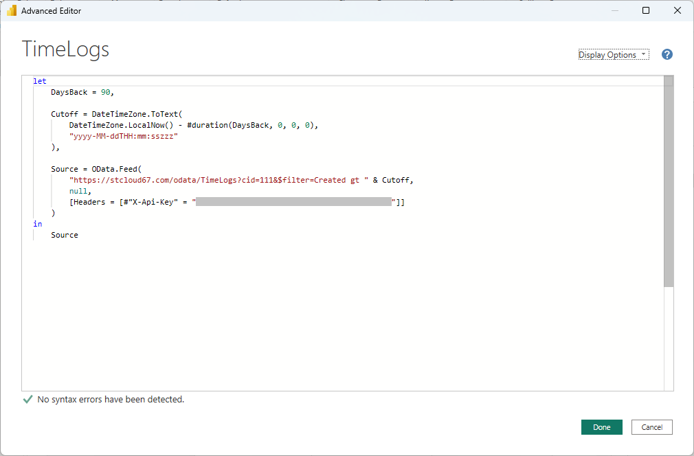
ProjectTasks — Rolling Window (last 180 days, recommended for large accounts with thousands of tasks)
let DaysBack = 180, Cutoff = DateTimeZone.ToText( DateTimeZone.LocalNow() - #duration(DaysBack, 0, 0, 0), "yyyy-MM-ddTHH:mm:sszzz" ), Source = OData.Feed( "https://stcloud67.com/odata/ProjectTasks?cid=YOUR_CID_HERE&$filter=Created gt " & Cutoff, null, [Headers = [#"X-Api-Key" = "YOUR_API_KEY"]] ), AddedDuration = Table.AddColumn(Source, "DurationDays", each if [FinishDate] <> null and [StartDate] <> null then Duration.Days([FinishDate] - [StartDate]) else null, Int64.Type), AddedOffset = Table.AddColumn(AddedDuration, "GanttOffset", each if [StartDate] <> null then Duration.Days([StartDate] - #date(2024, 1, 1)) else null, Int64.Type) in AddedOffset
Users (optional — Dashboard 3)
let Source = OData.Feed( "https://stcloud67.com/odata/Users?cid=YOUR_CID_HERE", null, [Headers = [#"X-Api-Key" = "YOUR_API_KEY"]] ) in Source
Clients (Dashboard 4)
let Source = OData.Feed( "https://stcloud67.com/odata/Clients?cid=YOUR_CID_HERE", null, [Headers = [#"X-Api-Key" = "YOUR_API_KEY"]] ) in Source
All DAX Calculated Columns — Paste on the ProjectTasks Table
Schedule Status = IF(ProjectTasks[Completed] = TRUE(), "Complete", IF(ProjectTasks[FinishDate] < TODAY() && ProjectTasks[Completed] = FALSE(), "Overdue", IF(ProjectTasks[StartDate] > TODAY(), "Not Started", "In Progress"))) Days Late = IF( ProjectTasks[Completed] = FALSE() && ProjectTasks[FinishDate] < TODAY(), DATEDIFF(ProjectTasks[FinishDate], TODAY(), DAY), 0 ) Completion Bucket = IF(ProjectTasks[PercentComplete] = 0, "1 Not Started (0%)", IF(ProjectTasks[PercentComplete] < 50, "2 In Progress (1-49%)", IF(ProjectTasks[PercentComplete] < 100, "3 Nearly Done (50-99%)", "4 Complete (100%)"))) Over Budget = IF( ProjectTasks[TaskCostClientActual] > ProjectTasks[TaskQuotedCost] && ProjectTasks[TaskQuotedCost] > 0, "Over Budget", "Within Budget" )
All DAX Measures — One-Page Reference
-- Counts (on ProjectTasks) Total Tasks = COUNTROWS(ProjectTasks) Completed Tasks = COUNTROWS(FILTER(ProjectTasks, ProjectTasks[Completed] = TRUE())) Overdue Tasks = COUNTROWS(FILTER(ProjectTasks, ProjectTasks[Completed] = FALSE() && ProjectTasks[FinishDate] < TODAY())) Tasks Starting This Week = COUNTROWS(FILTER(ProjectTasks, ProjectTasks[StartDate] >= TODAY() && ProjectTasks[StartDate] <= TODAY() + 7)) Tasks Finishing This Week = COUNTROWS(FILTER(ProjectTasks, ProjectTasks[FinishDate] >= TODAY() && ProjectTasks[FinishDate] <= TODAY() + 7)) -- Progress (on ProjectTasks) Avg Pct Complete = AVERAGE(ProjectTasks[PercentComplete]) Cumulative Completions = CALCULATE(COUNTROWS(FILTER(ProjectTasks, ProjectTasks[Completed] = TRUE())), ProjectTasks[CompletedDate] <= MAX(ProjectTasks[CompletedDate])) -- Hours (on ProjectTasks) Total Planned Hours = SUM(ProjectTasks[TaskDurationHours]) Hours Burned = SUM(ProjectTasks[ActualHours]) Hours Remaining = SUM(ProjectTasks[RemainingHours]) Hours Variance = [Total Planned Hours] - [Hours Burned] - [Hours Remaining] Burn Pct = DIVIDE([Hours Burned], [Total Planned Hours], 0) * 100 Schedule Efficiency = DIVIDE(AVERAGE(ProjectTasks[PercentComplete]), DIVIDE([Hours Burned], [Total Planned Hours], 0) * 100, 0) -- Cost (on ProjectTasks) Total Quoted Cost = SUM(ProjectTasks[TaskQuotedCost]) Total Actual Cost = SUM(ProjectTasks[TaskCostClientActual]) Total Remaining Cost = SUM(ProjectTasks[TaskCostClientRemain]) Budget Variance = [Total Quoted Cost] - [Total Actual Cost] - [Total Remaining Cost] Cost at Completion = [Total Actual Cost] + [Total Remaining Cost] Overrun Amount = [Cost at Completion] - [Total Quoted Cost] -- Projects (on Projects table) Active Projects = CALCULATE(COUNTROWS(Projects), Projects[Active] = TRUE())
Recommended Table Relationships
Set these up once in Model view. They apply across all four dashboard pages:
| From Table | From Column | To Table | To Column | Cardinality |
|---|---|---|---|---|
| Projects | ProjectID |
ProjectTasks | ProjectID |
One → Many |
| Clients | ClientID |
ProjectTasks | ClientID |
One → Many |
| Users | UserName |
ProjectTasks | SubsystemName |
One → Many (optional) |
Refresh & Publishing
- Manual refresh: In Power BI Desktop, click Home → Refresh to pull the latest data from the Maverick OData feed at any time.
- Scheduled refresh: Publish the
.pbixfile to Power BI Service (powerbi.com), then set up a scheduled refresh in the dataset settings. Cloud (stcloud67.com and others) accounts need no gateway. On-premise accounts require a Power BI On-premises Data Gateway. - Incremental refresh: For accounts with very large task histories, wrap the ProjectTasks query in the rolling-window variant from the Quick Reference section above and configure Power BI's incremental refresh policy using the
RangeStart/RangeEndparameters.
Excel and Other Apps Can Also Consume OData
Maverick's OData feed is a standard HTTP/JSON API, not a Power BI-specific connector. Any application that can make authenticated HTTP requests can read your project data. That includes Excel, which ships with the same Power Query engine used by Power BI Desktop, making it possible to build refreshable dashboards and PivotTables entirely within a spreadsheet.
Excel Power Query
The M queries on this page paste directly into Excel with no changes. The steps are nearly identical to Power BI:
- In Excel, click the Data tab in the ribbon.
- Click Get Data → From Other Sources → Blank Query.
- In the Power Query editor that opens, click Home → Advanced Editor.
- Paste any M query from the Quick Reference section above. Replace
YOUR_CID_HEREandYOUR_API_KEY. For on-premise, remove the&cid=…parameter. - Click Done, then Close & Load.
The data loads into an Excel table. From there you can build PivotTables, PivotCharts, XLOOKUP-based summaries, and conditional formatting dashboards — all refreshable on demand via Data → Refresh All. Excel dashboards are a natural fit for finance teams and stakeholders who already live in spreadsheets and want Maverick cost and hours data without adopting a new tool.
Other OData-Compatible Apps
Any tool that supports OData v4 or authenticated HTTP/JSON can connect to the Maverick feed using the same API key pattern:
- Tableau — use the OData connector in Tableau Desktop, passing the API key as a custom HTTP header named
X-Api-Key. - Python / pandas — use the
requestslibrary to call any OData endpoint, passingheaders={"X-Api-Key": "YOUR_KEY"}, then load the JSONvaluearray into a DataFrame. - Power Automate — use the HTTP action with the
X-Api-Keyheader to pull live task or timesheet data into automated flows and approval notifications. - REST clients — Postman, Insomnia, and curl work for ad-hoc queries and debugging. Add the
X-Api-Keyrequest header and the response is standard JSON with an@odata.contextenvelope and avaluearray containing your records.
For the full list of available entity sets, properties, and Edm types, see the OData Schema Reference. For a step-by-step walkthrough of your first OData connection to Power BI, see the Power BI OData Integration guide.