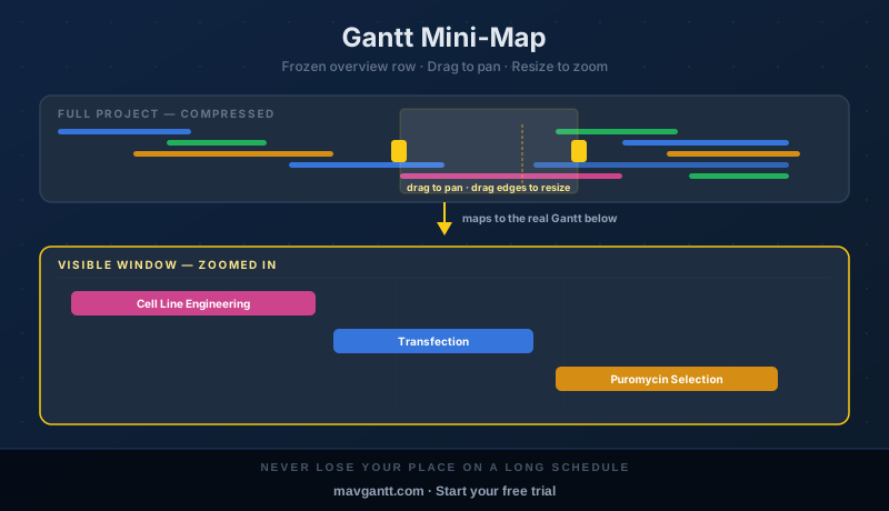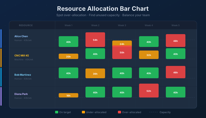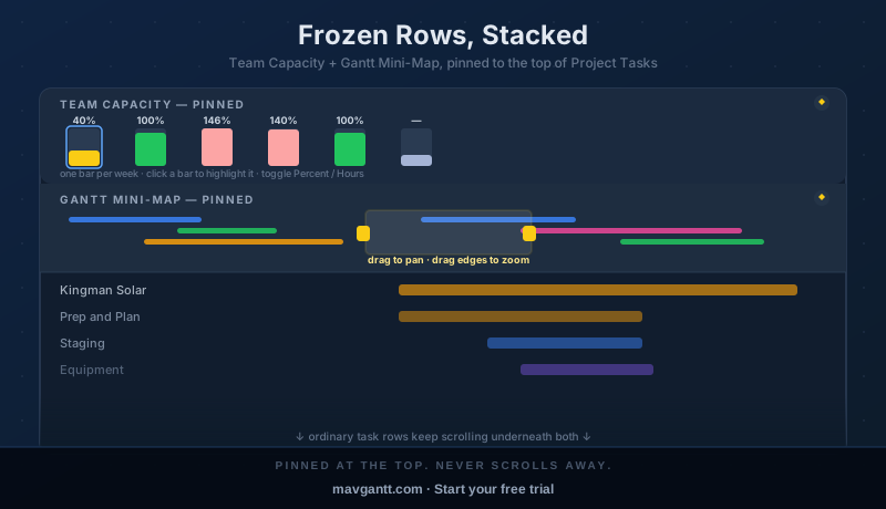
The Gantt mini-map answers "where am I in the schedule?" without scrolling. A second, separate frozen row — the Team Capacity strip — answers a different question at the same glance: "is anyone on this project over- or under-loaded in the next few weeks?" Both are pinned rows you can add to the Project Tasks grid from the same Settings category, and they were built to stack: schedule overview on one line, workload on the next, ordinary task rows scrolling underneath both.
This guide covers turning both on, what changes when you stack them, and — since it hasn't been documented elsewhere yet — a full walkthrough of the Team Capacity row itself: reading its colors, switching between Percent and Hours display, what its guidance message means, and how to drill from a bar straight into the tasks behind it.
Turning Them On
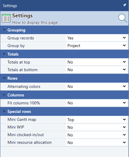
Open the Settings panel for the Project Tasks grid and scroll to the Special rows category. Two of the four entries there are relevant to this guide:
- Mini Gantt map — the compressed overview strip. Works on any Gantt-capable grid (Project Tasks, Projects, Subprojects, Users), not just Project Tasks. Full detail in Gantt Mini-Map: See the Whole Project at a Glance.
- Resource allocation mini-chart — the Team Capacity strip this guide covers in depth below. It only computes and renders on the Project Tasks grid; the setting still appears (and simply does nothing) on any other grid, the same accepted limitation the Mini WIP and clocked-in/out rows already have.
Both are independent three-way dropdowns — No (default), Top, or Bottom — and each choice is remembered per grid across reloads. Setting both to Top is what produces the stacked view in the next section.
Stacking Them Together
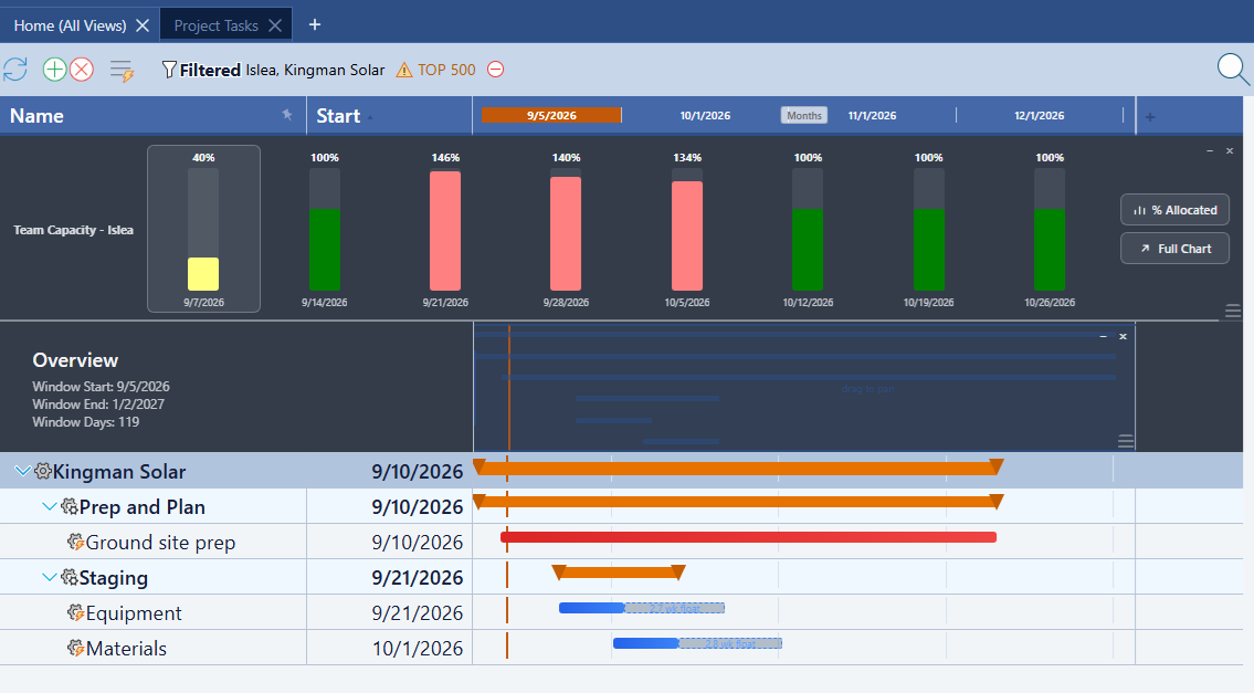
With both set to Top, they pin one above the other at the top of the grid — the Team Capacity strip first, the mini-map's "Overview" row beneath it — and your ordinary task rows scroll underneath both without disturbing either. Nothing about turning one on changes how the other behaves; they're two independent rows that happen to share the same Settings category and the same "never scrolls away" mechanism.
What's easy to miss the first time is that the two rows don't share a timescale. Drag the mini-map's viewport window to zoom the real Gantt chart in tight, and the Team Capacity row underneath doesn't move a single bar:
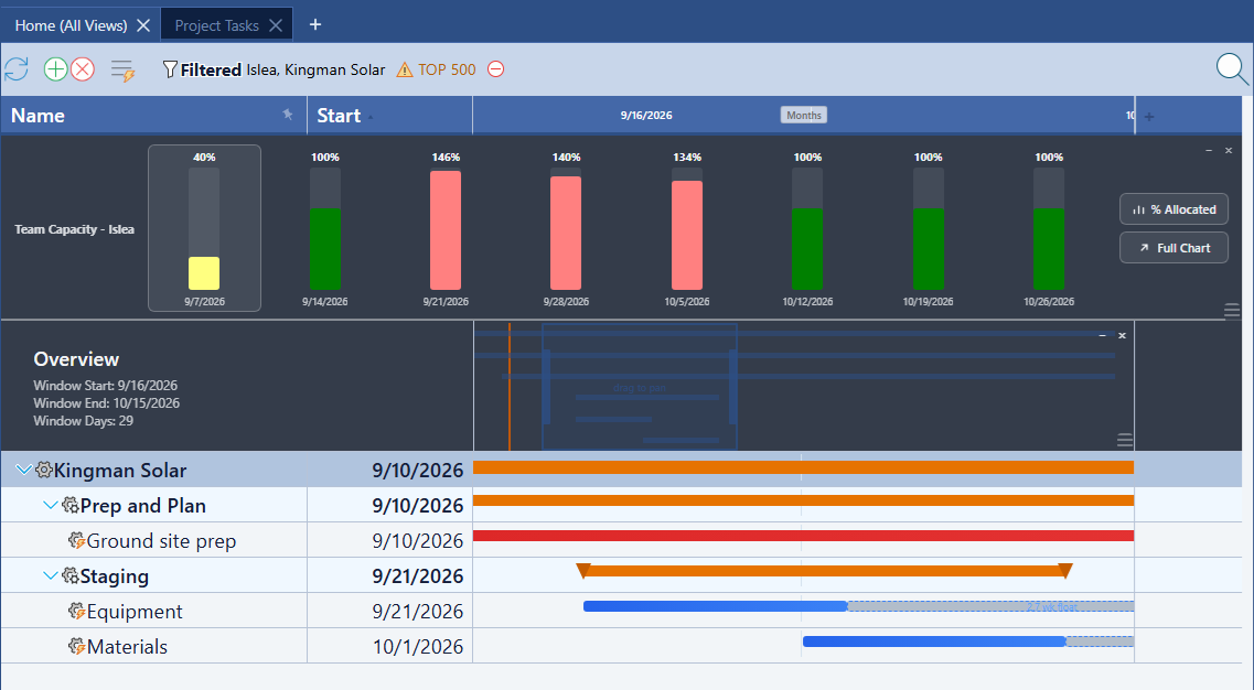
In this pair of screenshots the mini-map's own summary line shows the visible window shrinking from 119 days to 29 as it's zoomed in — but the Team Capacity bars above stay exactly the same. That's deliberate:
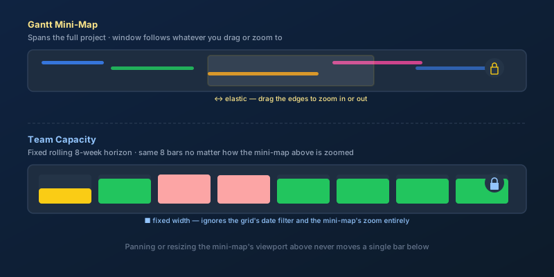
- The Gantt mini-map is elastic — it spans the whole project and follows wherever you drag or resize its viewport.
- Team Capacity is fixed — it always shows a rolling 8-week horizon starting today, regardless of the grid's own date filter, the mini-map's zoom level, or anything else on screen.
Think of them as answering two different time questions side by side: "where in the whole project am I looking right now?" above, and "what does the next couple of months of workload look like, no matter where I'm scrolled to?" below.
Reading the Team Capacity Row
The row is scoped to whichever project(s) the Project Tasks grid is currently filtered to, and shows one bar per week for up to eight weeks. Each bar carries a percent-allocated label on top, a colored fill that reads at a glance, and the week's start date underneath.
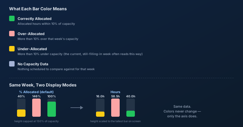
The colors use the exact same math as the full Resource Allocation bar chart — this strip is a compressed read of the same underlying numbers, not a separate calculation:
| Color | Meaning | Threshold |
|---|---|---|
| Green | Correctly Allocated | Allocated hours within 10% of capacity |
| Salmon | Over-Allocated | More than 10% over that week's capacity |
| Pale Yellow | Under-Allocated | More than 10% under that week's capacity |
| Gray-Blue | No Capacity Data | Nothing scheduled to compare against that week |
One thing worth knowing before it causes a false alarm: the current week (marked with a highlighted border) often reads pale yellow simply because the week isn't over yet — hours booked so far are naturally below the full week's capacity. That's expected, not a sign anything is wrong.
Percent Mode vs. Hours Mode
A toggle button above "Full Chart" cycles the row between two ways of drawing the same bars — no re-fetch, the switch is instant and remembered in your browser:
- % Allocated (default) — each bar's height is sized against its own week's capacity, visually capped at 150% so one wildly over-allocated week can't flatten every other bar by comparison. This matches the real chart's own semantics.
- Hours — each bar's height is instead sized against the tallest allocated-hours value currently on screen, and the top label switches from a percentage to the actual hours booked. Useful when you want to compare raw workload rather than percent of capacity.
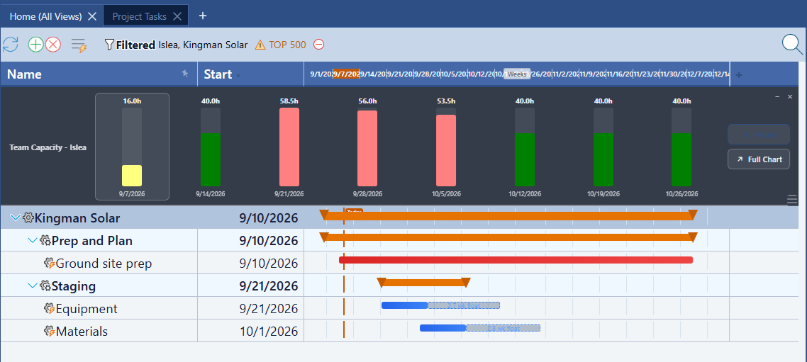
Compare this to the percent view shown earlier — it's the identical project and the identical week (146% and 58.5h are the same bar, just read two different ways). The colors never change between modes; only the axis does.
When It Needs a Filter
The Team Capacity row is a hard scope cap, not a suggestion — computing it costs more than the mini-map's free client-side draw, since it queries actual task assignments. Rather than silently disappearing when it can't run cheaply, it tells you exactly what to change:

It computes real bars under either of two conditions:
- The grid's project filter selects between 1 and 5 projects, or
- The grid's filter selects one specific person (not a workgroup or manager node) — a genuine individual can't fan out into an unbounded query the way a group could, so this path is allowed regardless of how many projects are also selected.
Outside those conditions — zero projects, "All Projects," or more than five — the row still renders (turning the Setting on always shows something), just as the guidance text above instead of bars.
Clicking Into a Bar
Hovering a bar shows a tooltip listing the tasks that contribute to it, with hours and dates:

A single click highlights the bar and, if it has at least one contributing task, pops a toast with the record count and total hours:
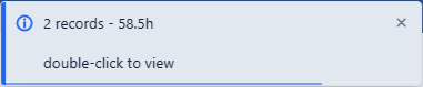
Follow the hint: double-click the same bar and Maverick opens a new tab filtered to exactly those Project Tasks records — the identical drill-down the full-size Resource Allocation chart's own bars already support. Right-clicking a bar has no special behavior here, matching the full chart.
Resizing and Removing a Frozen Row
Both rows share the same drag-resize grip in their bottom or top-right corner (whichever edge is away from the grid's own header), letting you drag the row taller or shorter — the Team Capacity row clamps between roughly 120px and 400px. The small controls next to the grip minimize the row to a thin strip, restore it, or remove it outright, which is the same as flipping its Setting back to No.
See Your Whole Schedule and Your Team's Workload at Once
Start a free cloud trial, open the Project Tasks grid's Settings panel, and turn on both the Gantt mini-map and the Team Capacity row — a full schedule overview and a workload check, both pinned in place while you work.
Access the Free Cloud Trial