
Every project manager has experienced the slow-motion disaster: a team member quietly drowning in work while another has barely enough to fill their week — and nobody noticed until it was too late to fix without pain. The resource allocation bar chart exists to prevent exactly that. It turns invisible workload data into a color-coded picture you can scan in ten seconds and act on immediately.
This guide explains every part of the chart, what the colors mean, how to adjust the time scale for different planning horizons, and — most importantly — what to actually do when you see red.
What the Chart Shows
The resource allocation bar chart is a dedicated view in Maverick that answers one question at a time for every resource on your project: Is this person or machine carrying the right amount of work this week?
The view is organized as a grid of rows and columns. Each row belongs to one resource — a person, a machine, or both if you're looking at a team. Each column represents a time period: a day, a week, a month, or a quarter depending on how you've set the zoom. At the intersection of every resource and every time period sits a single bar. That bar's height tells you the allocated hours. Its color tells you whether those hours are a problem.

Six components make up the chart:
- A — Resource Row: one row per resource, showing name, resource type (Human, Machine, or Material), and weekly capacity in hours
- B — Capacity Line: a dashed horizontal reference line drawn at that resource's maximum available hours per period — cross it and the bar turns red
- C — Over-Allocated Bar (red): allocated hours exceed capacity; the resource is committed to more work than they can deliver in that window
- D — Under-Allocated Bar (yellow): allocated hours fall noticeably below capacity; available time is going unused
- E — On-Target Bar (green): hours sit at or near capacity — the resource is busy without being overloaded
- F — Time Axis: adjustable scale across the top; drag to zoom in for daily detail or zoom out for a quarterly overview
Here is what the chart looks like in Maverick, showing several resources across a project with a mix of green, yellow, and red bars:
Reading the Colors
The color system is the heart of the chart. Maverick calculates each bar's color automatically based on the ratio of allocated hours to available hours for that resource in that period. You never have to do the math — you just have to know what each color is telling you.
Green — On Target
A green bar means the resource is correctly loaded. They have enough assigned work to be productive, and they have not been assigned more than they can deliver. Green is the goal. A project where every resource is green every week is a project running at full efficiency with no one at risk of burning out or falling behind.
In practice, a 100% green project is rare — schedules shift, tasks get added, people take leave. But every red or yellow bar is an opportunity to move toward green.
Yellow — Under-Allocated
A yellow bar means the resource has committed hours, but they are not close to their weekly capacity. There is slack — time that is currently unassigned. Yellow is not an emergency, but it is a question: Is this intentional?
Sometimes under-allocation is planned. A team member might be holding capacity for incoming work that hasn't been formally scheduled yet, or they might be recovering from an intense period. Other times, yellow reveals a genuine scheduling gap — tasks that haven't been assigned yet, or work that was assumed to be happening but never got formally assigned to anyone.
Yellow is the color that helps you avoid scrambling. If Alice has 20 unassigned hours in week three, and you know a new task is arriving that week, you can assign it to her now before someone else over-books you into a red situation.
Red — Over-Allocated
A red bar is a problem that needs to be resolved. It means the resource has been assigned more hours than their capacity allows for that period. If nothing changes, one of two outcomes will follow: either work slips (tasks take longer than planned because there aren't enough hours to complete them) or quality degrades (the resource rushes, works overtime, or drops something).
The red bar is precise: it tells you exactly how many hours over capacity a resource is, in exactly which week. That precision is what makes it actionable.
The Capacity Line
The dashed horizontal line running across each resource row is the capacity line. It represents the maximum hours that resource can deliver in a single time period — typically 40 hours for a full-time employee working a standard week.
Capacity can differ by resource. A part-time contractor might have a 20-hour capacity. A machine that runs two shifts might have an 80-hour capacity. Each resource carries its own capacity setting, and the chart draws the dashed line at the right level for each one individually.
The capacity line also changes with the time scale. If you zoom out to monthly view, a full-time employee's capacity line jumps to roughly 160 hours (40 hours × 4 weeks). The bars grow proportionally. The color thresholds stay consistent — a bar crossing the line is red, a bar well below it is yellow, a bar at or near it is green.
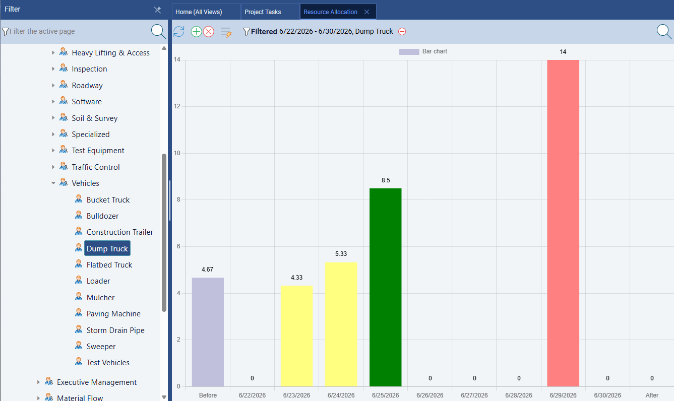
Machine Resources: A Day-View Example
The allocation chart works for every resource type — not just people. Machine resources follow exactly the same color logic: a bar that crosses the capacity line turns red, a bar well below it turns yellow, and a bar at the line turns green. The difference is the unit: a machine's capacity is typically measured in operating hours per day or per week.

In the example above, Dump Truck #1 has an 8-hour daily capacity — a standard single-shift machine. On Monday it is assigned exactly 8 hours: the bar sits at the capacity line and turns green. On Tuesday it is assigned 12 hours: the bar overflows the capacity line by 4 hours and turns red. The darker section above the dashed line shows the overflow — the portion of the day that cannot actually be delivered without running a second shift or changing the schedule.
Wednesday and Friday show yellow bars (5 hours and 3 hours respectively), meaning the truck is available for additional work those days. Catching this early — before the project is in motion — lets you redistribute Tuesday's load to one of those lighter days or bring in a second truck for the peak period.
Diagnosing and Fixing Over-Allocation

When you see a red bar, Maverick gives you three levers to pull:
- Move work to another resource. If another team member has yellow bars in the same week — unused capacity — that is the clearest fix. Reassign some tasks from the overloaded resource to the one with slack. In the diagram above, Alice is 16 hours over in week 2. Bob has 16 hours of unused capacity in the same week. Moving a task from Alice to Bob eliminates both problems simultaneously.
- Push tasks later in the schedule. If there is no one with available capacity in that week, the only honest option is to delay some tasks. Maverick's scheduling engine will update the Gantt when you change task dates, so you can see the ripple effect immediately. The question becomes: which tasks can slip without affecting a deadline, and which are on the critical path and cannot move?
- Add more resources to a task. If a task is time-constrained and no one can take over work, you may need to bring in an additional person. Assigning a second resource to a task splits the allocated hours, reducing the load on the first. This does not always speed up the task (some work cannot be parallelized), but it does resolve the allocation problem for scheduling purposes.
The bar chart does not tell you which lever to pull — that is a judgment call. But it tells you the size of the problem and the exact week it occurs, which is enough to make a decision.
Under-Allocation: The Hidden Cost
Yellow bars get less attention than red ones, but they represent real money. An under-allocated full-time employee is a paid resource delivering less output than planned. Over a multi-week project, consistent yellow on a critical skill set can cause just as many delays as over-allocation — tasks don't finish on time not because anyone is overworked, but because not enough hours were ever committed.
The most common causes of sustained under-allocation:
- Missing assignments: tasks exist but no one has been formally assigned to them. The work is "assumed" by the team but invisible to the scheduling system. Someone expects to do it; no one has told Maverick that.
- Overly optimistic estimates: tasks were estimated to need fewer hours than they actually require. The resource has capacity because the estimates were too low, not because the schedule is healthy.
- Waiting on dependencies: the resource cannot start their next task because a predecessor task is not complete yet. The yellow bar is correct — they genuinely have nothing assigned — but it signals a schedule bottleneck upstream.
- Leave or part-time periods: the resource is unavailable for part of the week. Their capacity is lower than the default, but Maverick hasn't been told about the reduced hours. The chart looks like under-allocation; it's actually correct allocation to a lower capacity.
Investigating yellow bars often leads to discovering unassigned tasks, which is one of the most common planning blind spots in project management.
Adjusting the Time Scale
The time axis at the top of the chart is adjustable. Changing it does not change the underlying data — it changes how much of the schedule you see at once and how granular each bar is.
- Day view: each bar represents a single day. Use this when you need to resolve a specific conflict in the next two weeks — too much detail for broad planning, perfect for surgical fixes.
- Week view: the default for most projects. Each bar is one working week. Week view is the right level for routine planning reviews and team allocation discussions.
- Month view: each bar is a calendar month. Use this for projects spanning quarters or years, or for an executive-level conversation about overall staffing levels.
- Quarter view: the broadest perspective. Useful for portfolio planning — seeing whether a resource is generally available for a new project over the next few months without getting into week-by-week detail.
A useful habit: start every planning session in week view to find immediate problems, then zoom out to month view to check that no single resource is consistently at red or yellow across the whole project. Local problems and global patterns each require a different zoom level to see clearly.
Filtering the Chart
On large projects, the allocation chart can show dozens of resource rows — enough that scrolling through all of them becomes its own problem. Maverick's filter controls let you narrow the view to exactly the subset you need to review:
- Filter by workgroup: show only the resources in the Engineering workgroup, or the Mechanical Design sub-team, or any other level of your resource hierarchy
- Filter by resource type: show only humans, only machines, or only materials — useful when you're specifically reviewing equipment utilization or headcount separately
- Filter by individual resource: show a single person's allocation across the entire project — effectively their personal workload timeline
Filtering is especially useful for one-on-one conversations. Pull up a single team member's allocation view before a check-in and you can see at a glance whether they're overloaded, coasting, or balanced — and have a more focused conversation about what's driving the numbers.
Resource Availability: The Companion View
The allocation chart answers "How many hours is each resource assigned?" The resource availability chart answers the inverse: "How many hours does each resource have left for new assignments?" These are two sides of the same coin, and switching between them gives you a complete picture of your team's bandwidth.

In the availability view, a tall bar is good — it means the resource has significant open capacity for the coming period. A short amber bar means they are mostly committed with a little room. A red "0h" marker means they are fully booked and cannot take on additional work without displacing something already scheduled.
The availability chart is particularly useful when a new task arrives mid-project. Rather than scanning every row of the allocation chart to calculate remaining capacity, you open the availability chart and immediately see who has the most room. In the example above, Diana Park has 36 hours free in week 1 — she is the obvious candidate for that new work. Bob Martinez has zero availability in week 2, so he cannot absorb anything scheduled for that window without causing an over-allocation.
The Bar Chart and the Gantt: Two Views of the Same Plan
The resource allocation bar chart and the Gantt chart are complementary views of the same underlying schedule. The Gantt shows you the sequence — what task comes after what, how long each one takes, where the critical path runs. The allocation bar chart shows you the load — how many hours each resource is carrying period by period, and whether that load is sustainable.
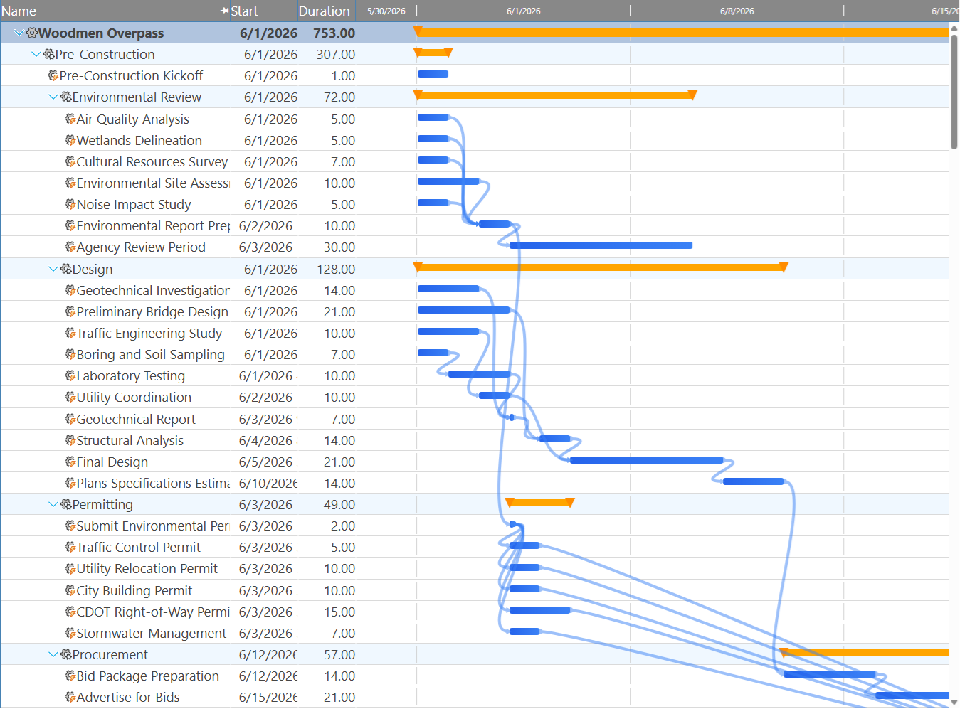
Neither view tells the complete story on its own. A Gantt can look perfectly sequenced while hiding the fact that one person is assigned to three overlapping tasks. A bar chart can show a balanced workload without revealing that the balance was achieved by pushing every task onto the critical path with no float. Using them together — switching between the Gantt and the allocation chart as you plan — is how experienced project managers catch problems that each view alone would miss.
A typical workflow: build the schedule in the Gantt, assign resources to tasks, then flip to the allocation bar chart to check that the assignments make sense. Red bars send you back to the Gantt to move tasks or change assignments. Repeat until everything is green. Then zoom the bar chart to month view for a final sanity check before you publish the schedule to the team.
What Materials Look Like in the Chart
Human resources and machine resources appear in the allocation bar chart as hour-based bars. Material resources behave differently. Because materials are consumed by quantity — kilograms, units, board-feet — rather than by time, their bars represent quantity committed in each period rather than hours.
A material bar crossing its capacity line means you've committed more of that material than you have available (or have budgeted to purchase) in that window. A yellow bar means the material is underutilized — either the task estimates are lower than reality, or you've over-ordered for that period. The same color logic applies; only the unit changes.
For most day-to-day use, the allocation chart is primarily a human and machine tool. Material tracking becomes important on construction and manufacturing projects where raw material supply is genuinely a constraint, not just a line item.
Making the Bar Chart Part of Your Weekly Routine
The allocation bar chart is most valuable when it becomes a habit, not a one-time activity. Many project managers review it at the start of each week — a two-minute scan of the week-view chart, looking for any red bars in the current week and any that are emerging in the next one or two. Catching an over-allocation one week before it happens gives you options. Catching it the morning it starts gives you a scramble.
A simple weekly review rhythm:
- Open the allocation bar chart in week view
- Scan for red bars in the current week — resolve any that exist
- Look one and two weeks ahead for emerging red bars — adjust task assignments now while there's still room to maneuver
- Check for persistent yellow bars — investigate whether they represent real slack or missing assignments
- Zoom to month view for a quick check of overall staffing shape across the rest of the project
The whole process takes five minutes once you know what you're looking for. The hours it saves downstream are harder to count.
For a complete reference of every field available on a resource record — billing rates, weekly capacity, AI provider settings, access rights, and more — see:
Every Resource Property, Explained
See Your Team's Allocation Right Now
Start a free cloud trial, assign your resources to project tasks, and open the Resource Allocation view. Green, yellow, and red bars appear the moment you have assignments — no configuration required. Find out in minutes whether your schedule is realistic.
Access the Free Cloud Trial
